Google declares war on Microsoft with their new favicon
Category:
Computing
Keywords:
Google
• Microsoft
• icon
• logo
• design
• web
Share on Facebook
Share on Twitter
Share on Digg
A while ago I noticed that Google has a new favicon (this one:  ). I was suprised, especially because it was so different from the old icons. So strange, so colorful...
...and then it hit me! Yes, that must be why it looked familiar and creepy at the same time. Here is how I imagine that the designer came up with it:
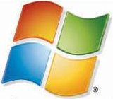
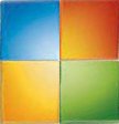
- Take the Windows Live icon:
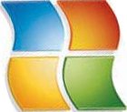
- Rotate it to the right:
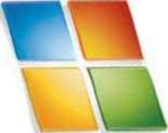
- Straighten the shapes:
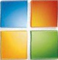
- Unshear it (to bring it to square shape):
- Remove the spaces, stick the pieces together:
- Warp it:
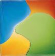
- Put a white g over it (sorry I don't have the exact font):


Now, what does it all mean? Let's see... maybe Google is taking Microsoft, tipping it over, straightening it and reducing it to basics, then distorting it and finally stomping all over it. Quite interesting, I'd say.
Note: If the process or the images are looking clumsy, it's because I'm not a designer. I just fumble around in GIMP.
Feel free to leave some comments below.
